
Recently the New York Times, as mirrored by the Seattle Times and other websites, posted an article titled “Red COVID.”
(I choose to share the Seattle Times version here, because the New York Times version is paywalled.) The article notes the deeply partisan divide in COVID statistics, and considers the reasons for this difference and possible solutions.
Maryland COVID Statistics
That article was timely because I had just completed a similar analysis of my own, and found similar results. I’ve never been one to blindly accept the analysis presented in some press story about a particularly important subject, when the raw facts are available to me too, and I can do my own fact checking analysis.
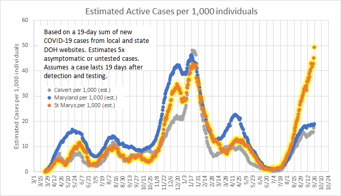
For some time, I’ve been watching the COVID rate in my home Maryland county of St Mary’s, and the next door Calvert County (directly adjacent, but separated by the St Mary’s River) and I continue to be amazed at the difference in rates since Delta kicked in.
All the analysis below was performed on data current as of the week of September 26th 2021.
St Mary’s County has the 4th-highest per-capita rate of new cases in the state, and is still rising largely unabated, while Calvert County just over the bridge is 15th out of 24 counties and much closer to the state average, and is leveling off.
What’s the difference?
Here’s a possible clue: much of St Mary’s is strongly Republican. That’s true in Calvert’s southern end nearest the base, but less so in the rest of the county.
Otherwise, there’s really not much difference between the two counties. There were some policy differences initially, and the St Mary’s County Commissioners were more aggressive about mask restrictions, which explains the overall lower rate last year (the Calvert blue line is consistently higher than the orange St Mary’s line, until July 2021).
Looking across Maryland, some additional information becomes relevant.
1) Counties that lean Republican (based on 2020 voting results) tend towards significantly lower vaccination rates than counties that lean Democratic.
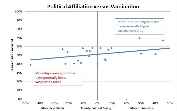
Anecdotally, I’ve found that to be true – there’s a VERY vocal anti-vax presence here in the county, especially among engineers who work on the Navy base, who have been very vocal in local forums complaining about implementation of the President’s mandate for vaccination for federal employees and contractors, with many threatening to quit, or at least implying they will. And the vast majority of civilian workers on the Navy base are Republican. Our county consistently votes >60% Republican, in a state that is otherwise quite blue. Calvert, by contrast, is generally liberal other than its extreme southern tip which is heavily populated with Navy base employees.
2) Maryland’s vaccination rates show an extremely strong correlation with the rate of new cases in the last 21 days. This is very much in line with worldwide data and also scientists’ expectations. (I picked the 21-day window since that’s about the length of a COVID case, and it’s short enough that it’s going to be all Delta variant cases.)
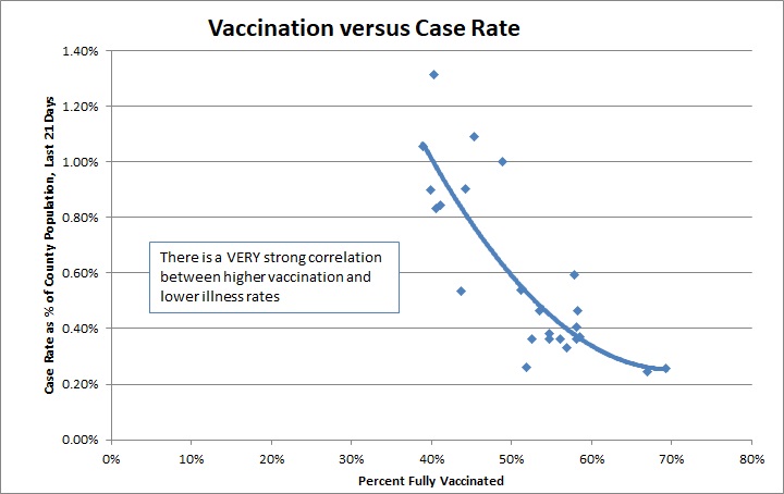
St Mary’s County is near the top of that curve, at about 1% of the population infected in the last 21 days. Calvert is near the bottom of that curve, at 0.4%.
Note that I’ve deliberately presented the data with scales starting at zero, so that there’s no visual foolery going on (it’s easy to warp people’s perceptions of a graph by picking misleading scales on the axes).
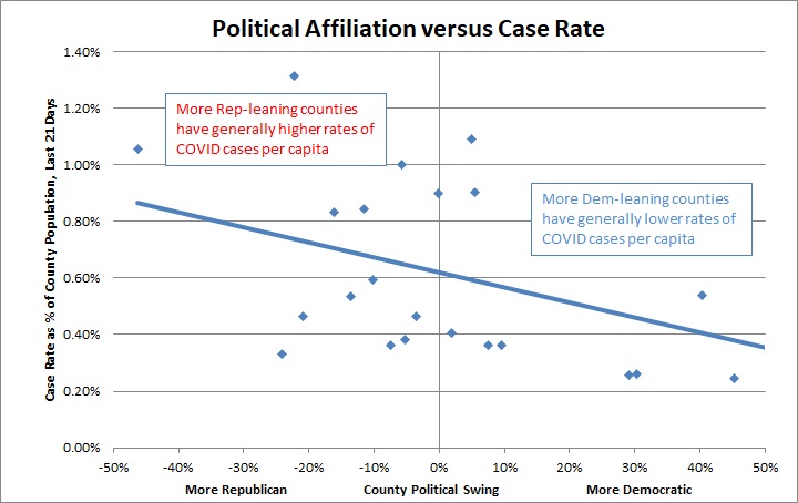
3) So as a result, locations that strongly lean Republican tend towards statistically higher COVID infection rates than those that strongly lean Democratic – about double the rate.
A vaccination rate difference between low-40 and high-50 percent may not seem like much, but when you combine the vaccination with also higher pre-vaccination infection rates in poorer counties in Maryland (according to sociologists, largely due to inequities in medical care and crowded living arrangements in poor neighborhoods), plus higher vaccine compliance in those same districts (because they tend liberal and more prone to accept vaccination), the population in those counties has much higher total immunity. And putting those together, total immunity in some Maryland counties turns out to be close to 100%, well above that needed for herd immunity in those areas (estimated around 80% for Delta COVID).
The remaining cases in those areas are likely coming from breakthrough infections, plus cases crossing boundaries (which are only lines on a map in any case).
In our area, the highest infection rates by far are in teenagers and their parents. So most of the current spread seems to be school-driven.
As an additional point of analysis, I noted above that St Mary’s County had lower rates for much of last year. That would imply a lower pre-existing immunity, which would lead to a more susceptible population this year (especially with Delta). However, that’s probably not sufficient to explain the difference. From March-December 2020, there were only 3700 confirmed cases in St Mary’s and 2700 in Calvert – a difference of less than 1% of the population of the counties (St Mary’s has 114,000 residents). If we assume that half of all the cases were detected (which is supported by national data), that’s still only a difference of a couple percent of the population between the two counties. That’s not enough to explain the doubled rate in St Mary’s now.
Looking at an entire county or state is a bit too granular for my tastes, since as noted above Calvert is politically very split between its northern and southern ends. The same is true in St Mary’s County, where a few districts are heavily Democratic. So I also did some analysis in St Mary’s and Calvert counties looking at voting districts and zip codes, for which state data can be found for both vaccination and COVID cases and support for presidential candidates. Although I don’t present the data here, the same trends appear true, even at this smaller more fine-grained scale: blue districts are significantly healthier; red districts have much higher case rates.
Florida COVID Statistics
When I first shared these statistics, I was challenged by someone I know who lives in Florida, who pointed out a handful of counties that seemed to break that mold – where strongly Republican counties had lower COVID rates – and tried to argue that it was unfair to call out Republicans for this problem. So naturally I dug into the Florida numbers to see if I was misunderstanding the trend in Maryland.
When I do the same county-by-county analysis for Florida that I did for Maryland, I see the exact same trends. There are outliers in both states, of course, but the trends are undeniable: More conservative-leaning counties have lower vaccination AND worse COVID infection stats, ON AVERAGE, even though there are some outliers.
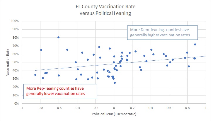
1) Considering political leaning (where numbers are >0 for Dem votes and <0 for Rep votes), ON AVERAGE there is a 28% increase in vaccination rate between the extremes. Note that the more Dem-leaning counties have less scatter in vaccination rate.
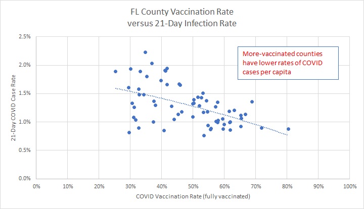
2) The plot of vaccination-versus-infection rate shows about a 50% reduction in COVID rates for a doubling of vaccinations. Again, the more-vaccinated the counties, the lower the scatter in COVID infection rates.
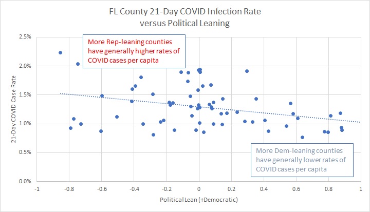
3) ON AVERAGE there is a corresponding reduction by 33% in COVID rates for Dem-leaning counties. As with the above charts, more Dem-leaning counties show less scatter in COVID case rates.
Understanding the Outliers
I think the Florida outliers can be deceptive because at the county level – for a huge county like Duval or Broward – there are pockets of different tendencies. (That’s why I looked at individual ZIP codes when I wanted to dig deeper into my local data. I won’t do that for FL, because it was a real pain correlating ZIP codes to voting results.)
Consider that a hot-spot of COVID infections will necessarily lead to elevated rates across the surrounding region. So a generally vaccine-compliant county with a pocket of anti-vax sentiment could skew the results in that county to higher infections. But the converse is NOT true: a generally anti-vax county with a pocket of vaccine compliance will NOT skew the results appreciably to lower infections.
Understanding the detailed situation in any one county is important. Sumter was noted as an example county that seemed to break the trends in my analysis. Consider that Sumter has the oldest median age of any US county and the highest percentage of 65+ residents in the US. So it’s not going to accurately reflect the situation in a more diverse sample across Florida. Given that we’re 18 months into COVID, and given the demographics, many of the Sumter residents will be (a) well-vaccinated, (b) survivors of COVID last year (14,000 total known cases in a county of 130,000, so likely >20% actual infection rate), and (c) vaccinated or infected early so their immunity is already fading. This combines to affect the current infection rate, where breakthrough infection rates can be non-trivial for people vaccinated the longest ago.
Also, the size of counties matters to this analysis; Glades County, also identified as one of those trend-breakers, is one of the least-populated counties in Florida, and across the United States there is a clear trend in population versus COVID rates – more spread-out counties have lower rates simply due to the dynamics of viral spread. So I personally would not use Glades as an example of a general tendency – just like I wouldn’t use North Dakota or Montana to help explain situations in New York or California.
So picking just a few counties out of Florida’s 68 counties will not give a good sense of the data. That’s why, when I became curious about my two local Maryland counties, I did some graphing of the larger situation so that trends could become visible.
Unlike Maryland, and particularly our two local counties, Florida has a much more diverse set of county demographics, so it’s a bit harder to tease out what is REALLY causing the differences. If I really wanted to get into this, I’d try to pick out population-density effects and demographic effects including health care access and age and living situations. I won’t bother with that, because that’s beyond my personal need-to-understand threshold.
But despite this limitation, I think the evidence is fairly convincing, as generally conveyed in both the New York Times article and my own parallel analysis, that political views are definitely affecting COVID infection rates, even if there are some outliers.
The Dangers of Cherry-Picking Data
The response from my acquaintance, trying to claim that my identified trend (as discussed in the New York Times article) was wrong because several Florida counties showed different results, illustrates the danger of cherry-picking some data to make a point. In any data with scatter, it’s possible to select a few contrary data points and make a very misleading case from those points.
The only way to understand a data set is to look with an unbiased view at the entirety of the situation, and then begin to dig into the reasons for divergence and scatter in the data.
Unfortunately, confirmation bias usually lends itself to this problem. Someone with a particular strongly-held viewpoint will tend to select data points that make their point, while not being careful to do a robust view of the entire data set.
I’m not a data scientist as such. I am an engineer with quite a bit of experience in analyzing data and drawing conclusions, but I’ve never been trained in hard-core statistical analysis. I’m also not an immunologist or sociologist. As such, my conclusions above are that of a generalist, and I do not claim that my amateur analysis is definitive. With that said, however, I do find the conclusions compelling.
So What?
Ultimately, the question is, so what? If one political party is worse off than the other because of this, can anything be done?
I think the last few paragraphs in the New York Times article are useful thinking. Finding a non-political point of emphasis and appeal is probably better than legal pressure, since it appears to me that the thing driving resistance to vaccination is MOSTLY that some people simply don’t want to be told what to do.
From that perspective, my point of emphasis on COVID and vaccination and masking remains this: My focus is thinking about what will keep other people healthy, not just keeping myself safe. Even if it’s inconvenient for me, I’m making choices based on lowering the rate of COVID for everyone. My choice not to put myself in high-COVID-risk situations isn’t just self-preservation; it’s about avoiding becoming another infection point among my family and friends and fellow citizens. If preachers and politicians were using that emphasis, appealing to people to take care of those around them, I think we’d get further than simply telling people to obey laws and rules.