
Last week I posted an analysis of party affiliation and COVID rates, based on my own state’s local county data. I have continued to dig into the same topic but now at a nationwide scale. I was interested in understanding the effect that increased COVID among GOP voters might cause in voter rolls across the nation.
Is it possible that the biased infection rates could kill a non-trivial higher number of GOP voters than Democrat voters, and thus affect political outcomes for years to come?
So I did an analysis of voter, COVID, and demographic data from every United States county, pulling the data from various online sources including census data, CDC COVID data, and 2020 vote results (data sources are linked below).
What I found was that, yes, it is likely that COVID deaths WILL be lopsided enough to affect the balance of political power, although it will be most likely at the local level and will probably not have a significant effect on national politics in the next congressional and presidential election cycle.
Caveats
I do not claim to be an expert in demographic analysis. This work is my own and done at an amateur level. (But I believe its conclusions to be instructive.)
This analysis does NOT consider the changes in voting due to satisfaction with how politicians are handling COVID – it ONLY considers how many voters become unavailable to each political party, considering the deaths.
This analysis makes some assumptions about COVID case rates and deaths moving forward. Such assumptions are naturally required for any forecast.
This analysis does not consider other demographic factors such as age, wealth, race, or housing, each of which could be used to refine the model and produce more accurate results.
Analysis of the Situation So Far
Across the United States, there has been a decided imbalance in COVID death rates for counties based upon their political swing, as shown in this figure. This imbalance, in general, is indisputable (based on raw data, not any assumptions) and appears to be a result of personal choices about masking and social distancing, plus local movement restrictions and masking policies, and compliance with those policies.
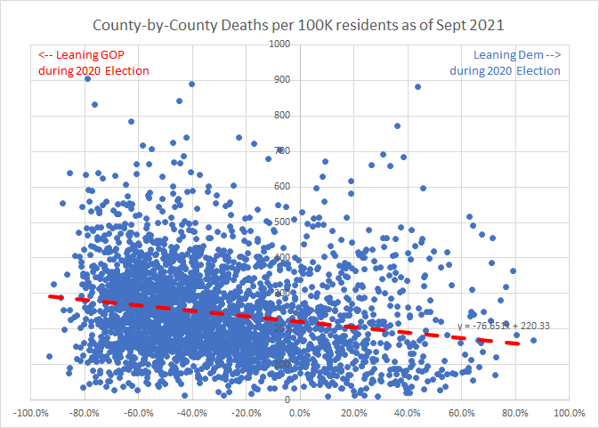
(Note: All the graphs on this page that show a -100% to +100% scale across the horizontal axis use the difference between vote percentages for President Trump and Vice President Biden in 2020. For example, a county that voted 60% Trump, 35% Biden would have a -35% value assigned.)
Based on a mathematical average of this general trend (the red dashed line above), I assigned a assumed split in death rates within any one county between GOP and Democrat voters. My assumption is that this general trend at a county-by-county level probably also applies to individual voter choices, and I believe it is therefore reasonable to bias the historical death rates accordingly.
As a result of this assumed difference in death counts as a function of political leaning in any given county, there is an imbalance in the deaths that trends towards the GOP, which should have swung the voter rolls in each county slightly Democrat, as shown in this figure.
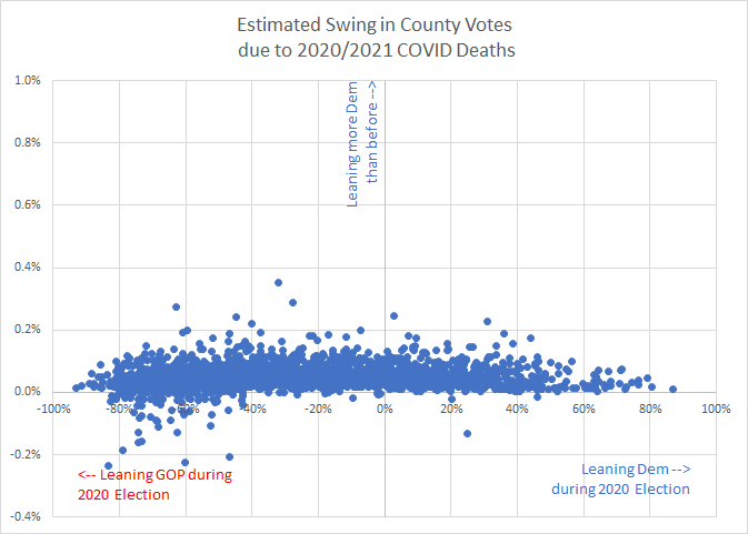
(Note: Positive/upward on the vertical scale represents more “left” voting; negative/downward represents more “right” voting.)
(Note: The few scattered points leaning right (downward on the graph) are all in very small counties, where only a few deaths occurred, and where tiny differences produce large effects.)
All the above information applies to what has already happened as of Sept 2021.
In essence, across the nation’s counties, the (assumed) imbalance in deaths will have already led to a slightly leftward shift in politics.
What Might Happen
Perhaps of greater interest is what might happen moving forward.
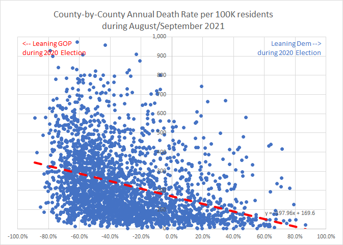
As noted in my previous analysis, there is a decidedly GOP-sided shift in vaccination refusal, and recent death rates (the last 60 days) are almost entirely unvaccinated individuals. Similarly, counties with more GOP votes in 2020 have far more deaths in the last 60 days. This chart shows the annualized/per-100k-resident death rate for August and September only. In deeply blue (Democrat) counties, there are very few deaths, while in the GOP counties the death rate is largely unchanged from before.
For the following analysis, I made an assumption that the last 60 days will be reasonably representative of the future demographics of deaths, given that the demographics have already been largely skewed by vaccination patterns, and people seem highly resistant to moving away from their current positions on masking and vaccination.
As a result, I believe it can be reasonably assumed that future deaths from COVID will follow the same trend.
Assumptions and Methods
Some deaths among Democrats will persist. Not all are vaccinated. Also, breakthrough cases are a reality, and will continue and possibly increase as vaccine immunity wanes over time. Furthermore, high community COVID rates in a red-leaning county will cause blue deaths as well.
As a result, based on the above chart and also data presented in this paper and this report, I selected a value of 18% of future deaths among left-leaning voters and 82% among right-leaning voters, as a reasonably likely split of death rates.
I did not assign any deaths to independent voters (who did not vote for either President Trump or President Biden in 2020). That proportion is fairly small – well under 5% in nearly every county, and usually under 2% – and can be safely ignored for this analysis.
To estimate the total number of COVID deaths yet to come, I made the assumption that COVID will presumably take another couple years to stop being a significant cause of death (24 months, hence 12 times the 60 days). But the current rate won’t hold constant; it will (hopefully – Dear God, let it be!) taper off with time and increasing vaccinations and fewer uninfected people. Thus I selected a 6x multiplier, which incidentally leads to approximately the same number of deaths as have already occurred. Thus, the “final” death toll is assumed to be about 6 times the last 60 days’ death rate (all of August and September 2021) before COVID fades away.
It is assumed that the majority of remaining deaths would occur before the 2022 elections.
Conclusions
Looking ahead at what might happen in the next couple years, my analysis indicates that nearly every county in the US will experience a pro-Democrat shift in voter composition purely due to current death rates. Based on my previous post, it appears that right now far more voters in GOP-heavy districts are getting sick and dying.
This chart therefore shows my estimate for voter roll swings county-by-county over the next two years. Nearly every shift is towards the blue/left/Democrats. In other words, more Republicans will likely die than Democrats, sufficient to nudge the balance of power left by under a half percent. (The median shift per county is 0.12%.)
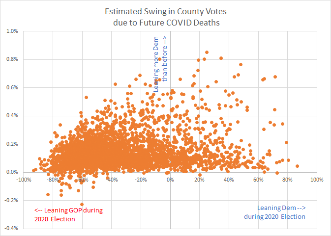
While the leftward median shift is small, some heavily Republican counties would shift left up by over 1/2%.
When the deaths in individual counties are aggregated to state levels, all states shift Democrat (moving upwards on this chart), but more GOP-leaning states generally shift further Democrat.
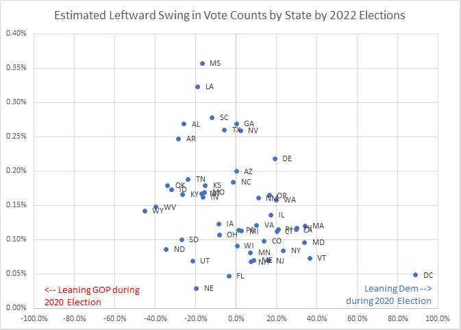
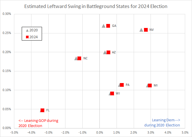
None of the centrist states – the battlegrounds in 2020 – such as Georgia, Nevada, Arizona, and North Carolina – shift enough to have changed their results in the 2020 election. The state most closely won by President Trump, North Carolina, would swing from a 1.4% GOP margin to 1.2% by about 2022.
Future Political Outcomes
Thus, it appears that Democrats will gain a small but real voter share in the long run in nearly every state, regardless of the state’s or county’s overall political affiliation. However, it’s a fairly small percentage. Remember that in most states the overall popular vote assigns the electors. Since none of the states appear to switch sides on this chart, it is assumed that the 2024 presidential race results would not change purely due to COVID deaths.
Most voting districts are not county-aligned, so it’s hard to say what effect this would have on congressional races. But in general, Democrats will have access to a slightly larger percentage of voters.
This effect may, however, have a noticeable effect on local politics, since the Republican counties lose harder. That could very possibly affect all kinds of local results, and those results would trickle up the seats of power over the following years. There are plenty of counties that are very close to evenly split, that would also shift left, possibly enough to shift local race results (such as state delegate or school board or attorney general races). These races often develop candidates who later go on to national office.
The effect could be somewhat muted by the fact that the most dramatic shifts will be in the most right-leaning counties, who can afford to lose some voter margin without losing political seats. (Sorry, that sounds callous, but there it is.)
With all this in mind, I think it’s fair to say that the vaccine refusal and anti-masking stances of the average Republican are tangibly hurting the GOP’s future, purely by killing a larger percentage of its voters than losses in the Democrat party.
The results are somewhat sensitive to that 6x multiplier. The relationship turns out to be perfectly linear. For example, if the number of COVID deaths ends up double what I expected, the swing in any county would double the shifts I computed.
Possible Further Modeling and Analysis
This analysis does NOT explicitly address other demographic reasons for the mortality ratios between counties. For example, counties with high proportions of single-family homes are more likely to be Republican and also have higher death rates – but their housing means they are more likely to be ABLE to socially distance. This would be complicated to assess in an analysis like this, since those two factors are confounding.
Other factors that should be considered include population density, median income, poverty index, education level, median age, and whether English is a primary language for most residents of a county. Each of those factors shows a fairly high correlation with COVID rates in a county.
So for a more thorough analysis, these factors would need to be included in the computation of likely death rates by party for a given county.
However, most of these factors are also already aligned with voting patterns – for example, higher population density, higher poverty, limited English, lower median income, or lower education levels are already aligned with left-leaning voting patterns, so it’s possible that these factors would not affect the results.
I am pretty much at the limit of my analytical ability with the work done above. I hope that someone with explicit training in demographic modeling could extend this admittedly simplistic analysis accordingly.
The raw data I used for this analysis, compiled from the sources below, is available here as a CSV file. The data were current as of 9/26/2021.
Data Sources
Demographic data through 2019 can be found here:
https://www.openintro.org/data/?data=county_complete
Correlation between county names and “FIP codes” which allow easy cross-referencing can be found here:
https://www.nrcs.usda.gov/wps/portal/nrcs/detail/national/home/?cid=nrcs143_013697
The 2020 election results can be found here:
https://raw.githubusercontent.com/tonmcg/US_County_Level_Election_Results_08-20/master/2020_US_County_Level_Presidential_Results.csv
The 2016 election results can be found here:
https://github.com/tonmcg/US_County_Level_Election_Results_08-20/blob/master/2016_US_County_Level_Presidential_Results.csv
The CDC’s data on COVID vaccinations can be found here:
https://data.cdc.gov/api/views/8xkx-amqh/rows.csv?accessType=DOWNLOAD
COVID death statistics can be found here:
https://static.usafacts.org/public/data/covid-19/covid_deaths_usafacts.csv
COVID case rates can be found here:
https://static.usafacts.org/public/data/covid-19/covid_confirmed_usafacts.csv
COVID Vaccination rates by political party were assumed from data quoted in this story:
https://www.brookings.edu/blog/fixgov/2021/10/01/for-covid-19-vaccinations-party-affiliation-matters-more-than-race-and-ethnicity/
Vaccine hesitancy data can be found here.
https://aspe.hhs.gov/reports/vaccine-hesitancy-covid-19-state-county-local-estimates